1
2
3
4
5
6
7
8
9
10
11
12
13
14
15
16
17
18
19
20
21
22
23
24
25
26
27
28
29
30
31
32
33
34
35
36
37
38
39
40
41
42
43
44
45
46
47
48
49
50
51
52
53
54
55
56
57
58
59
60
61
62
63
64
65
66
67
68
69
70
71
72
73
74
75
76
77
78
79
80
81
82
83
| import numpy as np
import matplotlib.pyplot as plt
import random
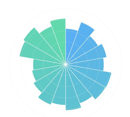
'''Rose Plot'''
''' This code creates a circle with cirtain part of colored fanwise
y=20
x=np.pi/2
w=np.pi/2
color=(206/255,32/255,69/255)
edgecolor=(206/255,32/255,69/255)
fig = plt.figure(figsize=(13.44,7.5))
ax = fig.add_subplot(111,projection='polar') #建立一个极坐标系
ax.bar(x,y,width=w,bottom=10,color=color,edgecolor=edgecolor)
plt.show()
fig.savefig("D:\_A_GGDD\_A_Research\picturelearning\Rose_plot.png",dpi=400,bbox_inches='tight',transparent=True)
'''
'''Rose Plot'''
'''An example'''
''' We divide the circle into 10 equal parts'''
x1 = [np.pi/10 + np.pi*i/5 for i in range(1,11)]
x2 = [np.pi/20+np.pi*i/5 for i in range(1,11)]
x3 = [3*np.pi/20+np.pi*i/5 for i in range(1,11)]
y1 = [7000 for i in range(0,10)]
y2 = [6000 for i in range(0,10)]
fig=plt.figure(figsize=(13.44,7.5))
ax = fig.add_subplot(111,projection='polar')
ax.axis('off')
ax.bar(x1,y1,width=np.pi/5,color=(220/255,222/255,221/255),edgecolor=(204/255,206/255,205/255))
ax.bar(x1,y2,width = np.pi/5,color='w',edgecolor=(204/255,206/255,205/255))
'''Now we finish the frame of the circle, then we can add data to the circle. For example, we use random data to fill the circle.'''
random.seed(100)
y4 = [random.randint(4000,5500) for i in range(10)]
y5 = [random.randint(3000,5000) for i in range(10)]
ax.bar(x2,y4,width = np.pi/10,color=(206/255,32/255,69/255),edgecolor=(206/255,32/255,69/255))
ax.bar(x3,y5,width = np.pi/10,color=(34/255,66/255,123/255),edgecolor=(34/255,66/255,123/255))
'''We almost finish the circle, but it's not really beautiful. We intend to add a small white circle in the centre'''
y6 = [2000 for i in range(0,10)]
ax.bar(x1,y6,width=np.pi/5,color='w',edgecolor='w')
labels = ['Section 1', 'Section 2', 'Section 3', 'Section 4', 'Section 5',
'Section 6', 'Section 7', 'Section 8', 'Section 9', 'Section 10']
for i, (angle, label) in enumerate(zip(x1, labels)):
ax.text(angle, 7500, label, rotation=np.degrees(angle)-90,
ha='center', va='center', fontsize=10, fontweight='bold')
ax.set_title('Nightingale Rose Chart Example', pad=20, fontsize=16, fontweight='bold')
from matplotlib.patches import Patch
legend_elements = [Patch(facecolor=(206/255,32/255,69/255), label='Category A'),
Patch(facecolor=(34/255,66/255,123/255), label='Category B')]
ax.legend(handles=legend_elements, loc='upper right', bbox_to_anchor=(1.3, 1.0))
for i, (angle, val1, val2) in enumerate(zip(x2, y4, y5)):
ax.text(angle, val1 + 200, f'{val1}', ha='center', va='bottom',
fontsize=8, color='darkred', fontweight='bold')
for i, (angle, val) in enumerate(zip(x3, y5)):
ax.text(angle, val + 200, f'{val}', ha='center', va='bottom',
fontsize=8, color='darkblue', fontweight='bold')
ax.text(0, 0, 'Rose Chart\n2025', ha='center', va='center',
fontsize=14, fontweight='bold',
bbox=dict(boxstyle="round,pad=0.3", facecolor='white', alpha=0.8))
plt.show()
fig.savefig(r"D:\_A_GGDD\_A_Research\PictureLearning\Nightingale_Rose_Chart\Rose_plot(texted).png",dpi=400,bbox_inches='tight',transparent=True)
|


.png)